Timken Museum, San Diego
I get a little bit of shutter-finger when I'm at a museum--I've never regretted having snapped a photo, but I have regretted not doing so. I'm posting a lot of these so they are saved somewhere other than my phone. :)
Veronese, 16th century, "Madonna and Child with Saint Elizabeth, the Infant Saint John, and Saint Catherine." I saw a couple Veronese paintings in San Diego. It seems like some of the colors he used must have faded over the years...


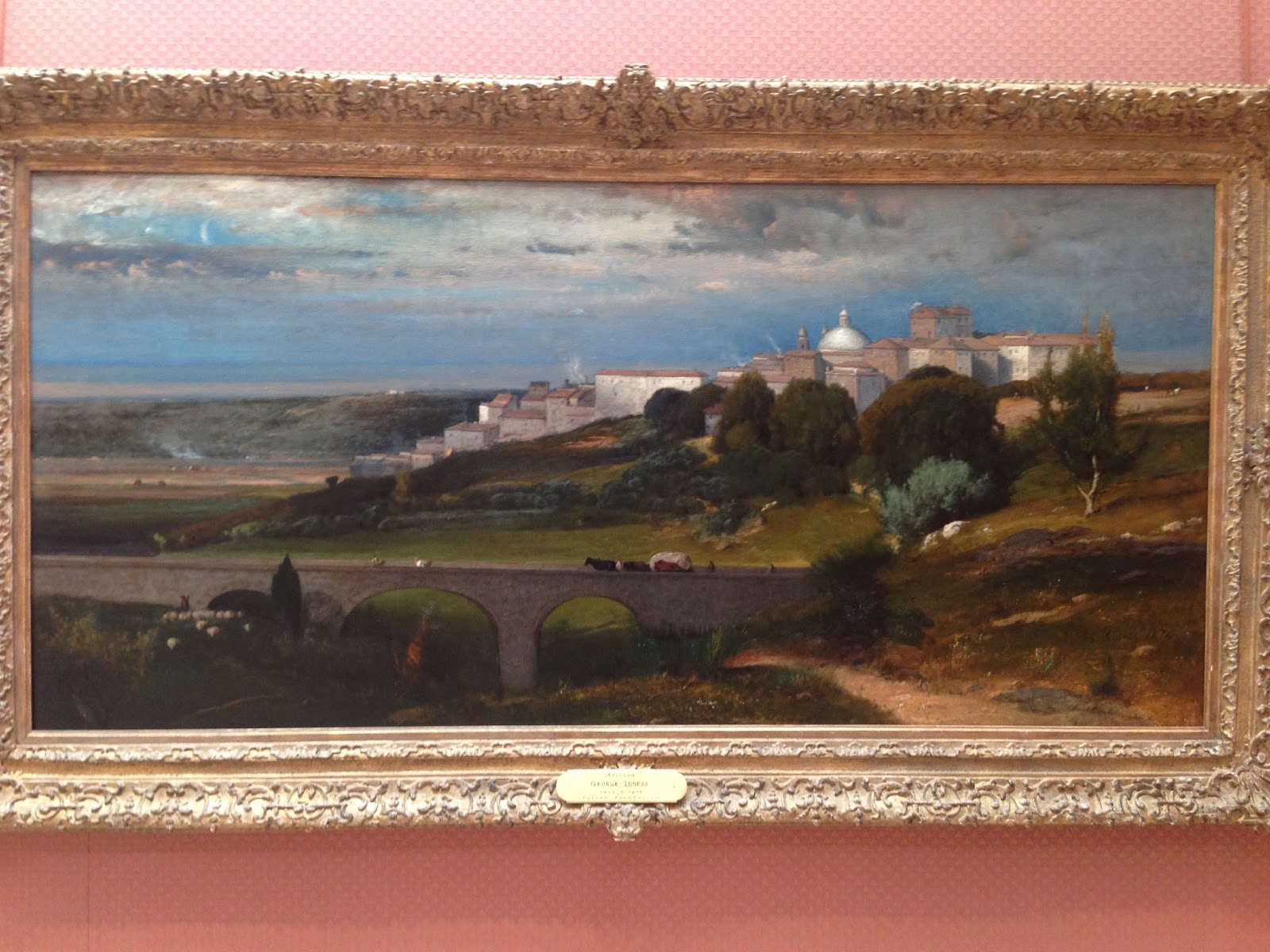
Corot, 19th century, "View of Volterra."

Fragonard, 18th century, "Blindman's Buff". Such beautiful subtlety in color and value here.

Nicolas de Largilliere, 17th/18th century. The way this guy handled drapery is amazing. And that metal corset on the woman! Talk about pain for fashion :P


Francois Boucher, 18th century, "Lovers in a Park". A little over the top, but it was done really well.


Raphaelle Peale, 18th/19th century, "Cutlet and Vegetables." This kind of reminds me of the still life studies coming out of contemporary academic art institutions.

Thomas Birch, 18/19th century, "An American Ship in Distress." The translucent quality of those waves! :o


Thomas Moran. Always that beautiful glowing color (and check out the little snakes or lizards out on the rock ;).


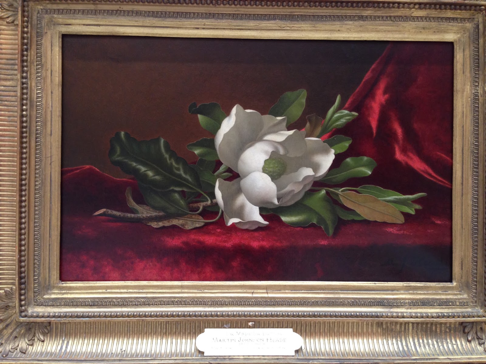
There's something so starkly beautiful about this hyper-finished flower. I almost don't like it, but then I kinda do... Martin Johnson Heade, 19/20th century, "The Magnolia Blossom." I'm thinking there was a postage stamp with this or a very similar picture on it at some point.
John Singleton Copley, 18th century, "Mrs. Thomas Gage." This one blew me away. That drapery! I knew nothing about this artist before viewing this painting. I spent a while reading the Wikipedia article on him and it was super interesting. He was something of a child prodigy and painted the portraits of many important historical figures, like John Hancock, John Quincy Adams, etc. I'm always surprised by how many really good artists there are whom I've never heard anything about. And how sophisticated the technique was in previous centuries. Kind of weird how we're all fumbling around trying to reinvent the wheel when it was all there already--too bad it's been so neglected the past hundred years or so :/ There's really nothing new, as clever as we think we are, ha.


Eastman Johnson, 19th century, "The Cranberry Harvest, Island of Nantuckett." The light effect <3


Fitz Henry Lane, 19th century, "Castine Harbor and Town". Loved the subtle color transitions here, though it's harder to see in the photo.

Albert Bierstadt "The Yosemite Fall". The docent was showing me modern pictures of this same scene, which was pretty interesting. It seems like docents like to talk to me, maybe because I stand around looking at things much longer than the average passer-by (I think I've heard people spend on average 2-3 seconds in front of a painting?). Either they chat with me or they watch me very carefully like I'm about to pull the thing off the wall, ha! I just like to look at all the brushstrokes and stuff. I'm not planning my escape, I promise ;)


Peter Paul Rubens. I've noticed a lot of masters of the past really make use of a warm undertone in their painting. It takes a lot of control to maintain that freshness and economy of paint, which I guess is why they are considered masters, right? :)

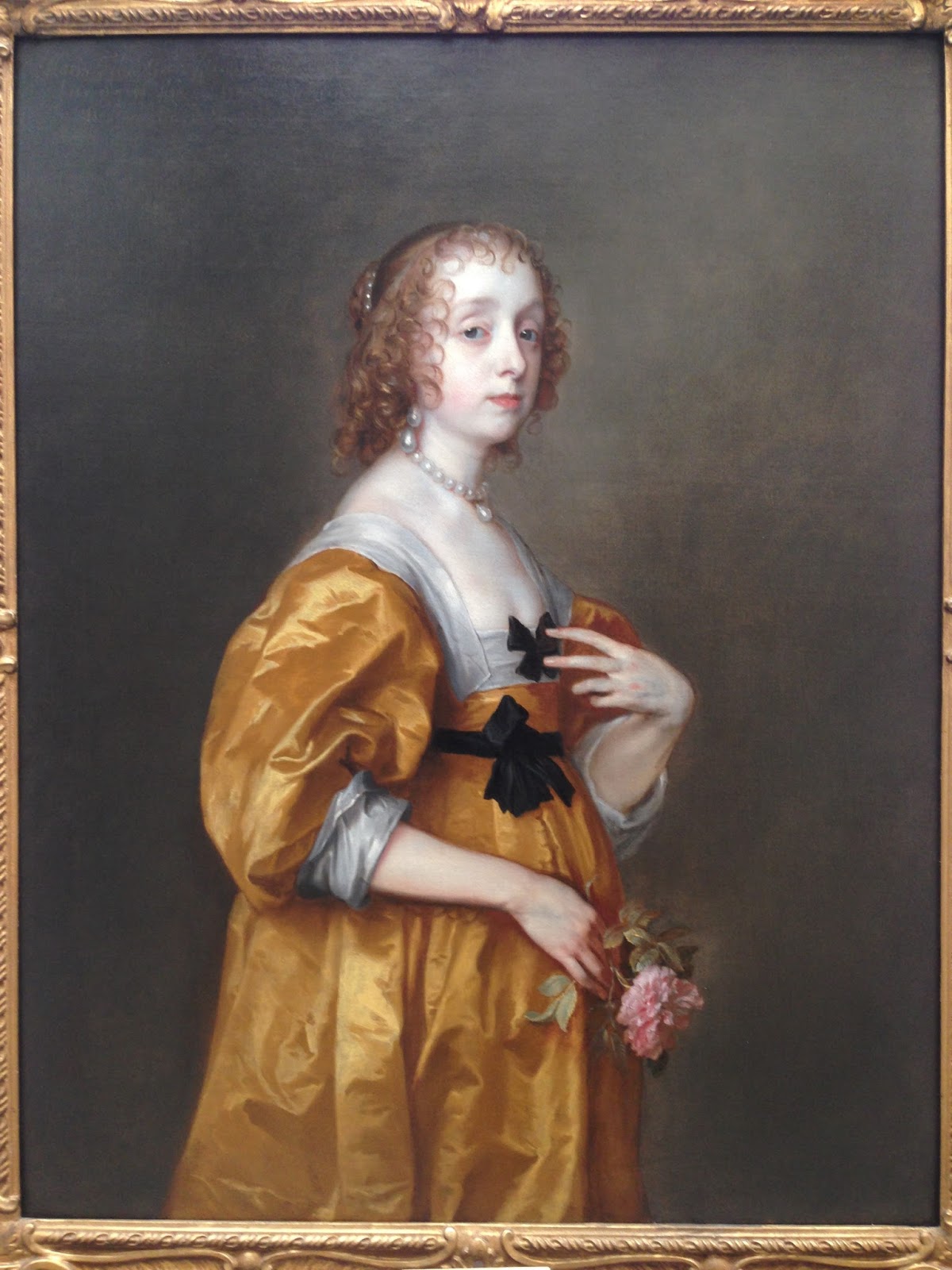
Van Dyck. It's funny how he has his own sort of ideal looking woman and every portrait bends to that look. He really liked long slender fingers. Long faces too. And pearls.


Rembrandt. I've been reading some Kenyon Cox lately and he was talking about the crude quality of some of Rembrandt's later painting. I think this is probably a good example of the cruder painting of his later years, though I didn't check the year.


Nickolas Maes, 17th century, "Portrait of a Lady." Haha, it's very well painted, but I don't know. This dog just kind of cracked me up. It would seem that the artist wasn't a big fan of little dogs--looks like a hideous little beast all wrapped up in red velvet ;)


Frans Hals. I would not like to paint all those weird ruffly collars they wore. What a pain.


This was a teeny tiny one :)


Comments
Post a Comment