Yellow is not a happy color.


6x6, 6x6, and 6x4"
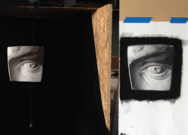
I've been trying to paint this poor yellow lily for the past few days--I'm not doing it justice. I've decided that yellow is just the most difficult color to paint. It's the shaded part of the petals that gets me... what is that color? Greenish? orangish? brownish? nothing-ish? Whatever that shaded stuff is, I'm not getting it. When you add black to yellow, it turns green. Blue, it turns green. Red, it turns orange/brown. So what is it? Probably something in between (or maybe a little of both). I'd like to figure this out, but today apparently isn't the day ;) On the first two, I had a white background, and on the third one went for a gray for contrast (and actually tried to paint it sight size--teeny tiny--thinking it might help me simplify all that yellow. and maybe it did. but still...).
I've read it takes miles of canvas to make a good painter, and I certainly haven't filled miles yet, so it's fine. Maybe I'll find a nice painting with yellow flowers and see if I can copy it and glean any mysterious knowledge. That's a good plan. Anyway, a healthy amount of failure in this process has got to be good--it motivates me to keep pushing. I'll paint a decent yellow flower if it kills me ;)


Color is relative. Like value. Don't look into the color you want, but consider it peripherally in relation to the whole color scheme. Is the light warm or cool? Cool light warm shadows, vice versa. Flowers demand pure color, getting grays by mixing complements. Gray your yellow with purple. A purple that is more blue will give greener grays, a redder purple browner warmer grays. Relate all colors to each other by looking peripherally. How do the shadows in the flower relate to colors in the vase? Place more importance on temperature and value. Find the warmest and coolest areas and use them as tuning forks for temperature relationships much like establishing your lightest light and darkest darks for value relationships. Always relate things to a standard, otherwise you'll be stabbing in the dark. Mix your own secondaries. Primary color palettes like the "Zorn" palette force you to find the limits of your restricted means, and also imbue more harmony. I might use cobalt blue, quinacradone red or maybe you use cad red, and cad yellow light for this setup. Take black off for flowers. Mix the grays in the background with compliments, focusing on temperature and value. The secret is relationships. Sorry I poke on here sometimes. I know you want to be really good. I'm super poor, but if you're interested id be happy to come give you some basic instruction in whatever for a fair price. If not no big deal. You can always ask me anything when you see me. Hope this helps.
ReplyDeleteBrock! Thank you for this comment. It is helpful. I will try the purple with the yellow--I tend to think more in terms of just red/yellow/blue with black thrown in if I absolutely have to, but premixing some complements first would probably help here. Ha, I didn't know you looked at this--how embarrassing ;) I might take you up on that instruction sometime! You're a good teacher.
DeleteNothing to be embarrassed about. I mean the link is in your Instagram. I like reading your descriptions of what you're doing. You're mostly right on track with your thinking. There's just more subtle snd practical info thats hard to arrive at on your own. Anyway sorry
ReplyDeleteHaha, don't be sorry. You are more than welcome to read my ramblings :) And you're right. There are a lot of things a person can be totally blind to without a little guidance.
Delete