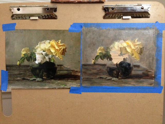
Another day, another bad lily.
4x6, water mixable oil on linen panel
Ha, well, here I go again ;) If I made any improvements here, they are subtle (just like the value and temperature differences in that horrid yellow). I took one piece of Brock's advice (see comments on previous post--one step at a time ;) and tried mixing the complement for the shaded parts of the yellow. I think it helped, but the values are still off. I may have been looking into the color too much.
Part of the problem is probably just in the drawing, too. These lilies look totally strange if the drawing is a little off. And maybe it's not even that the drawing is all that off--maybe it's something akin to how a prominent nose looks ever more prominent when you try to translate it into definitive lines in two dimensions (I know this all too well ;). Sargent eventually made it work with good ol' Madame X, but he's Sargent (compare Sargent's Mme Gautreau with Gustave Courtois'--that nose). Maybe because we see lilies in our fuzzy field of vision instead of harsh, transcribed reality, they're a little more pleasant in person--all those crazy angles feel a little more soft. And well, I certainly wasn't paying much mind to my edges.
Anyway, all this talk is just me trying to make sense of my ineptitude, but in truth, the drawing IS a little off. Add that to the lack of accurate value matching, and you've got a perfect little mess. Flowers really throw me off because if you match the value, you lose the saturation. And if you match the saturation, you lose the value. (one nice thing--I'm not alone in this problem. Try googling "yellow lily painting" lol).
Anyway, how correct can I expect to get it in an hour? I spend two hours on very incomplete line drawings of a figure, so these are really just little exercises in mixing/matching color, and that should be okay. Maybe I'll try again. Or maybe not. The good news is, I was quite literally laughing as I looked at all these little paintings in a row--laughing is good (unless, of course you're living in a Charlotte Bronte novel). And as one of my favorite female heroines likes to say, "Tomorrow is another day."
On a much happier note and even better news, my beautiful cousin Kami has a five-page article in Plein Air Magazine this month! She's a lovely Minnesotan with an infectious personality and that charming Midwestern accent. Her work consists mostly of landscapes and still lifes, and is just chock full of beautiful color harmonies. Congrats, Kami!:)


Color is most saturated and chromatic out of the tube, with the exception of deeper colors like maybe alizarin and ultramarine. A chromatic yellow will feel brighter than when it's mixed with white. White especially titanium will chalk up and destroy chroma. Lead white is warmer and more transparent. Think of fantin latour for its effectiveness. On art renewal center.org there is a book by Daniel burleigh parkhurst called the painter in oil. Very practically informative. Google it and there's free ebooks like on archive.org. There's a specific section on flower painting. Anyway. I'll shut up now
ReplyDeleteThanks, I'm downloading the book as I type! I do appreciate your tips, as usual :) I haven't tried lead white, but I probably should. They don't make it in the water mixable options I usually use while painting in the family room--they tend to focus on low toxicity. Fantin-Latour, wow.
Delete